I finally finished my fancy new website.
In January, I quietly went back to freelancing full time. I got busy with client work right away and didn’t have the opportunity to properly announce my big move. Today, I’m finally launching my website. And boy oh boy I’m excited about it!
I’ve been making websites professionally for almost 25 years. I wanted this one to be really special.
I love experiences that feel completely new yet instantly intuitive. It’s hard to do, but I think I pulled that off. ✨
If you haven’t seen it yet, have a looksee:
johnhenrymuller.com
Here’s a behind-the-scenes look at how the site came together …
Strategy: Show & Tell & Entertain
I’ve had a lot of positive feedback on my old website. But with starting out again, I really wanted a refresh.
My primary goals for the new website:
👀 Show Design Work
My old site was basically a pretty resumé, but showed no actual design work. If I wanted people to hire me for design, I guess I should show design.
📖 More Info, Please
How I work and what I actually do went unanswered before. This time around, I want to answer ALL your questions.
🎉 Fun!
I wanted novel elements and whimsical visuals to intrigue people who hire designers. Maybe even interesting enough to share.
Experience: All-in on Three Novel Ideas
I had three separate ideas bouncing around in my head for years that finally came together in a magical way. I went all in on all three of them.
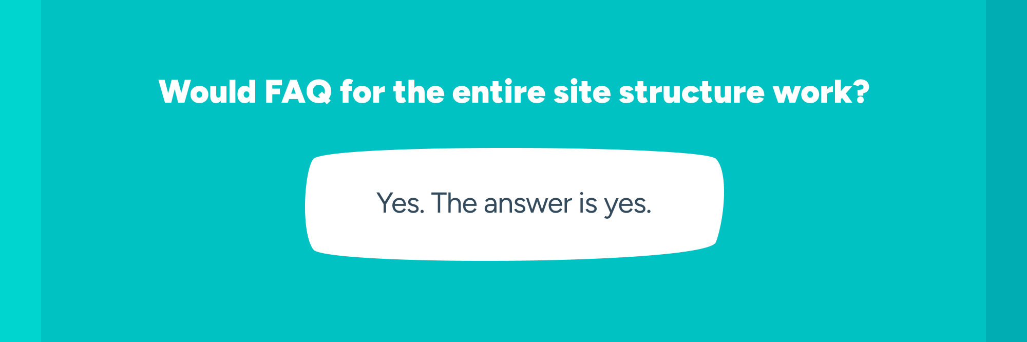
1) FAQ FTW
I know FAQs are often criticized as lazy content strategy. But when done well, they can really pull you in and feel like a conversation.
My curiosity: What if you leaned all the way into FAQs and made that the structure of the ENTIRE website?
Each section of the site is as if YOU are asking me questions. Overkill? Probably. But the site is an experiment, so I felt it appropriate to just go for it.
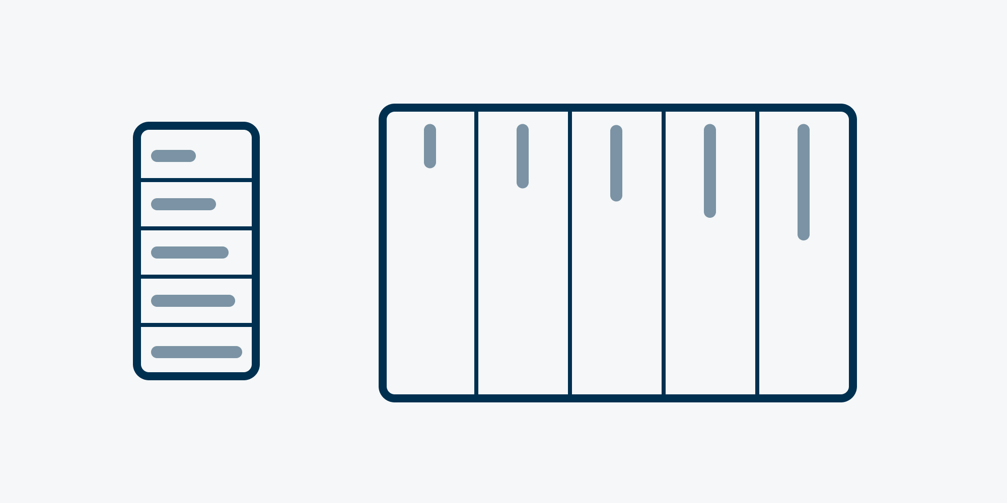
2) Accordion to Plan
Another idea I’ve been wanting to try for years is making an entire site one giant accordion menu.
I quite like accordions. Progressively disclosed information supports both skimmers and divers nicely. You can easily scan or dive deep when interested.
This is really a responsive web design idea. On mobile, the menu stacks vertically, allowing the site visitor to scroll and interact with the next section intuitively, so there is no need for a hamburger menu. On desktop, the closed panels move to the sides to fill the often sparsely used space while the primary content area becomes a slim, easy-to-read column. The side columns become the navigation.
As you finish with one section, the next section is right there waiting for you.
But the accordion menu needed smooth transitions to feel great …
3) SPA Experience on a CSS Budget
The third idea was to use CSS (with help from the :target selector) to make view-to-view transitions feel entirely fluid.
I feel comfortable with CSS. Less so with JavaScript. I wondered if I could develop the entire site without JavaScript and still get the fluid experience I was hoping for. The answer again: yes.
I leaned hard into the idea of no JS. The entire site is a hand-coded, single-page, ~111 kB HTML file with vanilla CSS in the <head>. No preprocessors. No frameworks. No npm. No CMS. No Google Analytics. No tag managers. No tracking pixels. No JS. No gluten.
I won’t pretend to know enough to soapbox about JavaScript. (Hey man. I’m, like, just a designer.) But Lighthouse sure seems to like my site.
And look! The back button works and the URLs are always in sync. (Even for the modals!)
Nerds only:
If you are interested in seeing how all this works, you can download my entire website.
Download johnhenrymuller.com[ .zip | 27.41 kB ]
Visual: Colorful Language
I wanted to maintain the flat, bold, minimal brand aesthetic I’ve used in the past, but make it a little more fun.
The accordion experience created a blocky layout which lent itself naturally to colorful bars. The CSS allowed for transitions. That means ✨color changes✨! Each section could have a unique color scheme.


The colorful accordion blocks were vibrant, but still a little too rigid. Whimsically-shaped boxes paired with thick marching lines broke up the rigid look nicely.
For the typeface, I went with Figtree by Eric Kennedy. It’s a beautiful, geo-sans, variable font with a range of weights including a very chunky one suitable for the aesthetic I was going for.
Look Who’s Talking
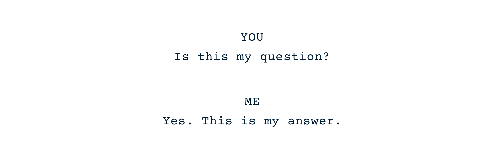
With the all-FAQ idea, constantly switching from two perspectives (you asking, me answering) could get clunky, or worse: confusing. I needed an intuitive clue: Your questions are white text on colored backgrounds. My answers are placed inside white word bubbles.
This solution allowed me to keep the obnoxiously vibrant colors and have longer form content on white.
Showing My Work
With showing more design work being a primary goal of the website, work case studies needed special treatment.
I worried the ultra-playful look would distract from the visual work samples. So each “project” would launch in its own modal to create a new context to dive deeper into the work.
The mobile layout uses a horizontal scroll (a bit like an Instagram carousel) to allow you to flip through samples with a flip of your thumb. The desktop version uses a spread-out vertical scroll. I am not going to torture you with horizontal scrolling on desktop. Each is the ideal display for the device.
The use of targets also allows deep linking to any work sample in any project and works on both desktop and mobile. Thanks, browsers!
Phew! I think that about does it.
It was a lot of work, but I am happy with how it all came together.
Thanks for reading! Feedback is a gift (good or bad). So if you read this and have one additional minute, please send me an email! I’d love to hear from you!
johnhenrymuller@
Weeeeeeeeeeeeeeeeeeee!
John Henry Müller
April 29, 2025