We found a better home.
How our new homepage outperformed the old, 2 to 1.
We released Pack last fall with what we thought was a pretty solid homepage. It had all the bells and whistles you’d like to see on a modern product website: approachable hand written headline, custom ambient background video, playful colors, benefit-led descriptions of key features, scroll triggered animations, prominent call-to-action, charming microcopy, responsive, CSS3, HTML5, blah blah blah. All of the things.
Recently we officially switched over to a drastically simplified homepage after A/B testing for 10 days.
The results of this test were surprising and frankly: embarrassing.
This new, ultra simple homepage consistently outperformed the old homepage by double. Double.

During the A/B test, the percentage of visitors to new account signups through the new homepage was consistently double than the old homepage. A potentially more impressive statistic is the bounce rate plummeted from a steep 47% to an unheard of 2.6% — meaning over 97% of people interacted with the new homepage when visiting.
Before getting into why I think the new homepage performed so much better, I’ll go into where I think I went wrong with creating the old homepage.
Problems with the original approach
It wasn’t until looking back months later that it became clear where things may have gone wrong during the process of designing the old homepage.
Fatigue
We didn’t approach the homepage until right before we were about to launch Pack. We’d spent months grueling over the minutiae of product details but the homepage was just “a content page” we that we could throw together later.
It became a looming bullet on our launch list. Not exactly the best approach when you are talking about something as emotional as someone’s very first impressions of your product.
Lack of inspiration
The truth is, the old homepage never sat well with me. When working through concepts, it was motions without emotion. I just didn’t feel it. It could have been fatigue. Anyway, it lacked soul. I never connected with it.
Lost leader
Without ever connecting with the homepage, I never became its advocate. I never owned it. And neither did anyone else. I become a disenchanted project manager asking for bits of copy and programming help just to get it out the door.
Over-designed
With lack of confidence in the concept, I made a classic rookie mistake. I over-designed.
Don’t get me wrong, I still love all the individual elements of the old homepage. All the elements just didn’t seem to add up to something with greater impact.
Twenty-twenty hindsight, right? Moving forward …
Seduced by a friendly wizard
Months after the web launch, well-rested and clearheaded I left behind assumptions about account creation when diving into concepts for our mobile app. This time, I started with a question I should have been focusing on all along: “What would be the best first time experience?”
The answer: it depends. It depends whether they have a dog. (Pack is for people who love dogs, btw.)
If they have a dog, creating a profile and becoming part of a pack is the best first time experience. So we needed carefully coax dog owners into creating a profile for their dog.
If they don’t have a dog, we want them to preview different types of photos and understand that they will be able to tailor the types of content they’ll see.
So, it became obvious that we needed to start with a simple question: “Do you have a dog?” Once we know that, we can guide them to the best experience. Not only on the mobile app, but also on the web.
After a quick mockup of this simple question taking center stage we knew we were onto something. A few click through prototypes later and we could see that this simple wizard (WISAD) idea had legs.
I really liked the idea of creating an ante with this very simple question to get things started. The hunch is getting people engaged before the create account task will make that task more intuitive.
Flow
Here is the entire homepage wizard exploded out.
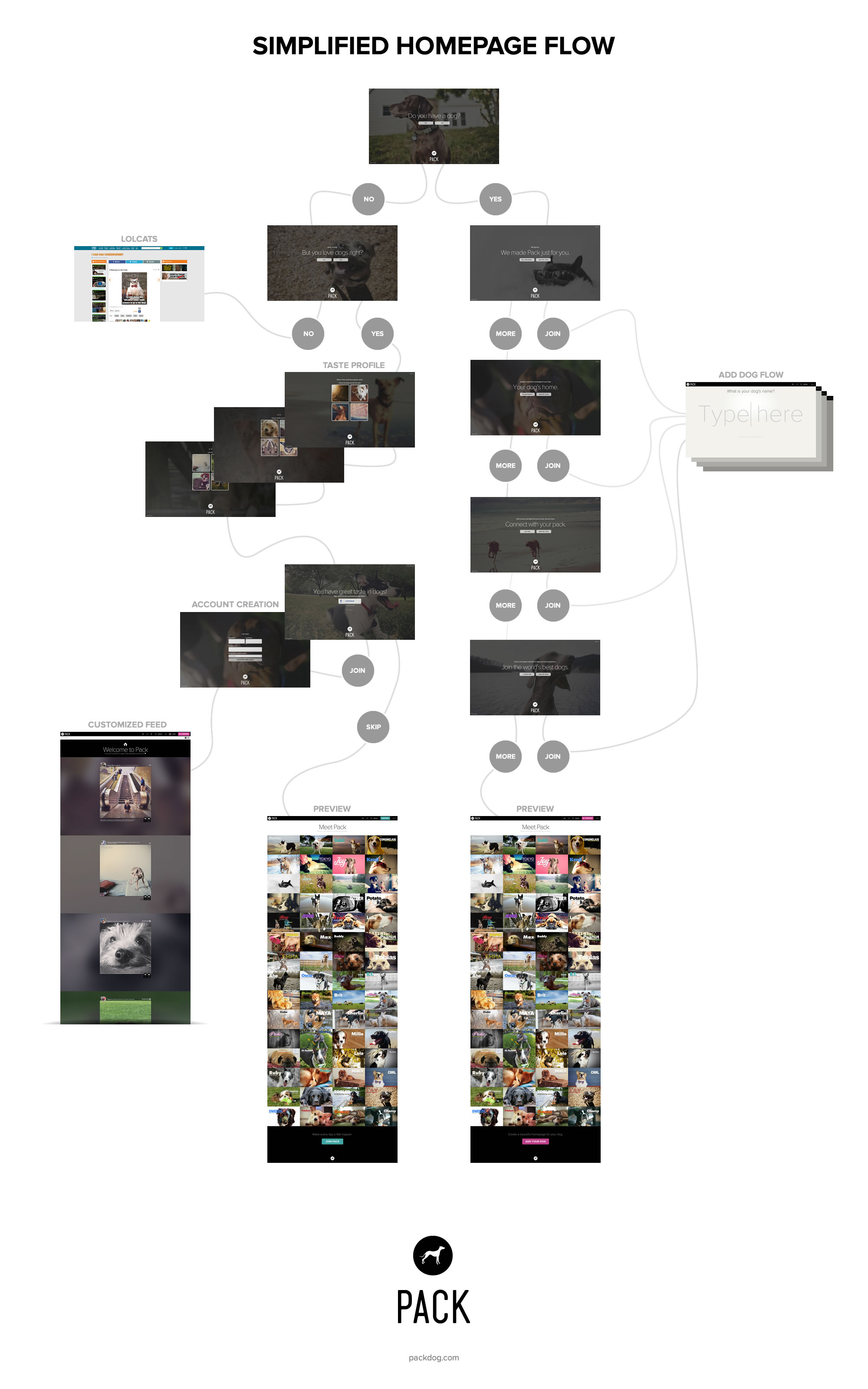
No dog. No problem.
If the person doesn’t have a dog, we must first qualify if Pack is right for them by asking if they even like dogs. If the answer is “yes” we move along to create a quick taste profile, simple account creation and finally a custom feed. 20 seconds. Tops.
Of course, the account creation can be skipped for now for a preview of some of our favorite profiles.
If they answer “no” to the liking dogs question, well, Pack isn't really for them. Off to LOLcats they go!
Has dog. Will travel.
If the person has a dog, we take the opportunity to welcome them. Then, each step is the option of learning more or joining.
If they move along through the three question gauntlet without adding a dog, they will see a preview page of some of our favorite profiles so they can get a more tangible idea of Pack before joining.
For us, this wizard approach felt right. It made the page three-dimensional.
I don’t recommend a wizard approach for most account creation experiences. In fact, I think part of the reason this works is because the uniqueness of the experience catches you off guard. Then the casual words put you at ease.
Reflecting on this project gave me a better understanding of how important it is to approach a design problem with a fresh perspective. And secondly, asking the right questions.
It’s these two things that saved this home.
You can see the live version here: packdog.com.
If you have feedback or questions feel free to email or tweet at me.
Weeeeeeeeeeeee!
John Henry Müller
P.S. If you enjoyed this post, you should tell someone about it :)
August 8, 2014